The daily experience

Nobody uses procurement software for ten minutes.

A buyer is in this thing from nine until five. The questions that decide whether it is any good are not on a feature list: can you stand looking at it all afternoon? Does it tell you what to do when it says no? Can you reach the people who built it without a form? Everything here is in the product now.

Three palettesLight, dark, and a low-strain green — switched from the corner of any screen, remembered per person
No default themeWith nothing set, Atlas follows the palette your operating system already asked you about
Measured, not assertedPrimary, secondary and muted text clear WCAG AA on every one of the three
One-way line to usA note to the people who build Atlas, from any screen, with no ticket and no reply expected
Three palettes

The same screen, however your eyes want it.

One button in the corner of the chrome, on every screen — not three levels into an administration page. How your screen looks is a personal preference, not an organisation setting, so no administrator sets it for you.
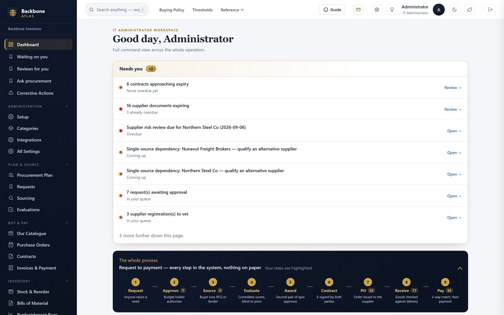
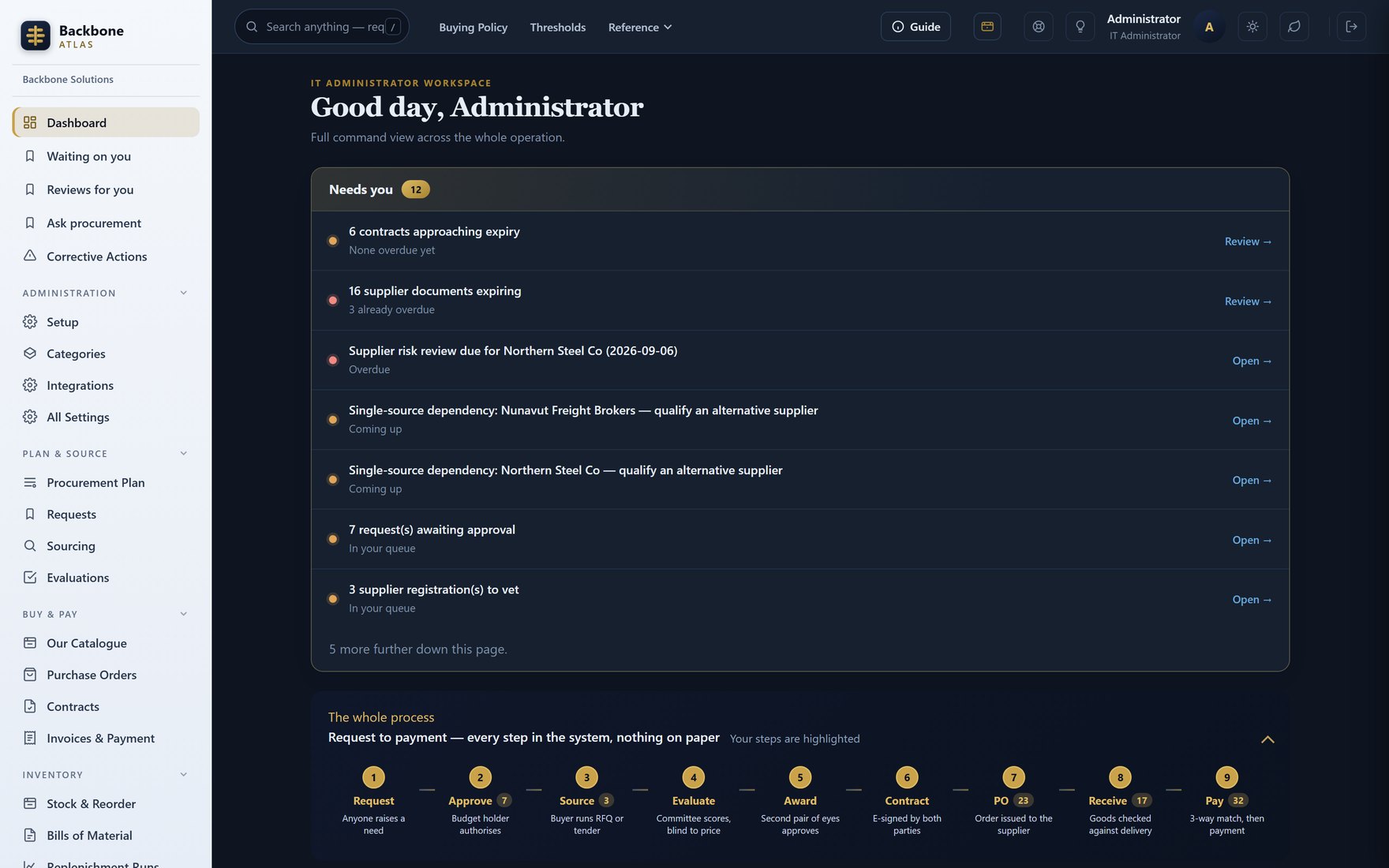
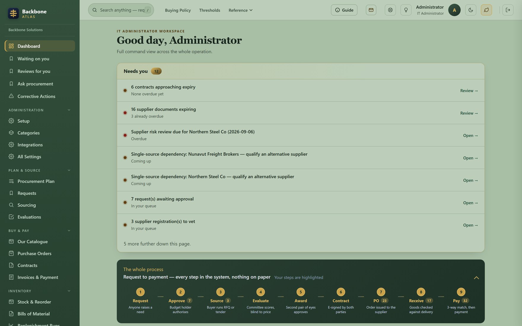
These are the real controls — press one
The Atlas dashboard in the light theme: a navy sidebar beside a white workspace.

Light Navy navigation, white workspace.

One screen, one set of data, photographed three times — nothing here is a mock-up or a colour filter over one image.

It follows your computer

Atlas ships with no default theme at all. Until you press the button it follows whatever your operating system already says you prefer, so somebody who runs their machine dark gets a dark Atlas on first sign-in.

It is remembered, per person

Your choice is stored in your own browser, not the company account. Two people sharing a workspace — or one person on a laptop and a desktop — each get the palette they chose.

Green returns you where you were

Turning the low-strain palette off returns you to whichever theme you were in before, not to a default. Work in dark, try green, and you get dark back rather than a white flash.

The low-strain palette

Easier on the eyes — and we will tell you exactly why.

There is a great deal of confident nonsense written about screen colour and eye health. Here is what this palette is actually doing, and what it is not.

What it does

It takes the glare out.

The thing with real evidence behind it is luminance. A large bright white field tires the eye over hours; so does pure white on pure black. This palette sits between them, reflecting roughly a fifth less light than the white one, measured on the same screen.

Our first attempt at this was about 1% dimmer. It looked greener and it did nothing, which is how we know the brightness is the part that matters.

What it is not

It is not a medical claim.

No colour on a screen treats anything. If your eyes hurt at the end of the day, the useful advice is still breaks, distance, blink rate and the light in the room.

Green earns its place for a smaller reason. Human vision peaks near 555 nm, so a green ground gives the most perceived brightness for the least light. That is second-order; the dimming is first-order, and does the work.

Legibility

A dimmer screen that is still readable.

Darkening a background quietly costs contrast on the palest text, and that is how a comfortable theme becomes an unreadable one. So every text colour moves with its ground, and the result is measured, not eyeballed. WCAG AA asks 4.5:1 on body text; these are today's ratios.

TextLightDarkLow-strain green
Primary headings, figures, names15.6:113.9:19.7:1
Secondary body copy7.9:18.9:16.2:1
Muted labels, hints, timestamps5.3:14.9:15.8:1

Each theme's text colour (--ink, --ink-soft, --muted) measured against that theme's panel colour. The AA threshold for normal text is 4.5:1, and the muted row is the one that matters — it breaks first on a darker ground. An automated check refuses a palette below it on every release.

Your workspace

It should look like your company, not ours.

Upload your logo and it appears in the top bar of every screen and on your sign-in page, beside your company name. Your IT administrator does it in your own settings: it is your brand, so it is not ours to set.

It sits behind a hairline rule at the end of the bar, rather than replacing our mark. That is what the arrangement honestly is: two companies sharing a toolbar.

The file is checked properly

The type is read from the file's own bytes, never its name or what the browser claims. SVG logos are refused outright: an SVG can carry script, and this image is shown to everyone who opens your workspace.

It is stored with your data

The mark lives inside your workspace's own database. It comes back with a restore, rather than depending on a second set of files staying in step.

Guidance in place

The manual is on the screen that needs it.

"What am I supposed to do here?" arrives mid-task, and nobody stops to open a Word document to answer it.

A panel, not a page

Guidance for the screen you are on opens beside your work and closes again. It is specific to that screen and your role: an approver and a requester on the same page are told different things.

Search that reaches everything

One box in the chrome, reachable by pressing / from anywhere. It searches requests, orders, contracts and suppliers together, rather than making you pick which list to look in first.

Written for people who did not buy it

The person raising a request did not choose this software and does not care how it works. The guidance is written for them, in the same words the screens use — one vocabulary throughout.

When it says no

A refusal that says nothing reads as a broken system.

The commonest way business software wastes an afternoon: it declines, says "invalid input", or returns you to a blank page, and you cannot tell a rule from a bug. So Atlas has one rule: every refusal names what was wrong, what the limit is, and what to do next. A test fails the build if a route refuses silently.

What you usually get

Invalid file.

Is it the size? The format? Did it upload at all? The only way to find out is to try things.

What Atlas says

That image is 2,480 KB against a 512 KB limit. A logo this large is usually a photograph or a print-resolution export; save it for screen use and it will be a fraction of the size.

The actual number, the actual limit, and the thing to do about it. Nobody has to guess, and nobody has to ask us.

The same rule where it costs us something. A supplier uploads a 45 MB tender document and lands back with no file and no message. During a live competition, from outside your organisation, they will conclude the system ate their bid. That is a dispute, not an annoyance — so a test enforces it, not good intentions.

Telling us things

Two buttons, and they are not the same button.

Both sit in the chrome of every screen. One opens a support ticket, with a reference, a readable status and a person who answers. The other sends us a note and does not answer at all, on purpose.

A ticket carries a promise, and that promise is what stops somebody sending the one-line remark that was the most useful thing we heard all week. "Sort this list by date" is not worth a case, so it goes unsaid. Hence a second, lighter channel that costs nothing.

Support

Something is wrong, unclear, or a number looks off. You get a reference, the screen you were on and the version you were running are captured automatically, and somebody replies.

Feedback

An idea, a small friction, or something that works well. It goes straight to the people who build Atlas. No reference, no reply — and the form says so before you type.

Every note is read. They are a large part of what decides what gets built next. That claim is worth rather more from a company of this size than from one with a product council.

See it, don't read about it

Press the buttons yourself.

Switch the theme mid-demo, make it refuse something on purpose, and see what it tells you. It is a short call and there is no deck.

Book a demo